Selecting the right hues for your brand defines the best jewelry packaging because color psychology directly influences consumer perception of value, luxury, and trust. Many jewelry brands struggle to create a lasting impression, often relying on generic containers that fail to evoke an emotional response during the unboxing process. This lack of visual strategy can undermine the premium nature of your pieces, potentially driving high-value clients toward competitors who have mastered visual storytelling. By strategically choosing the best jewelry packaging colors, you transform a simple box into a powerful marketing asset that reinforces brand identity.
Why is black the best jewelry packaging for luxury?
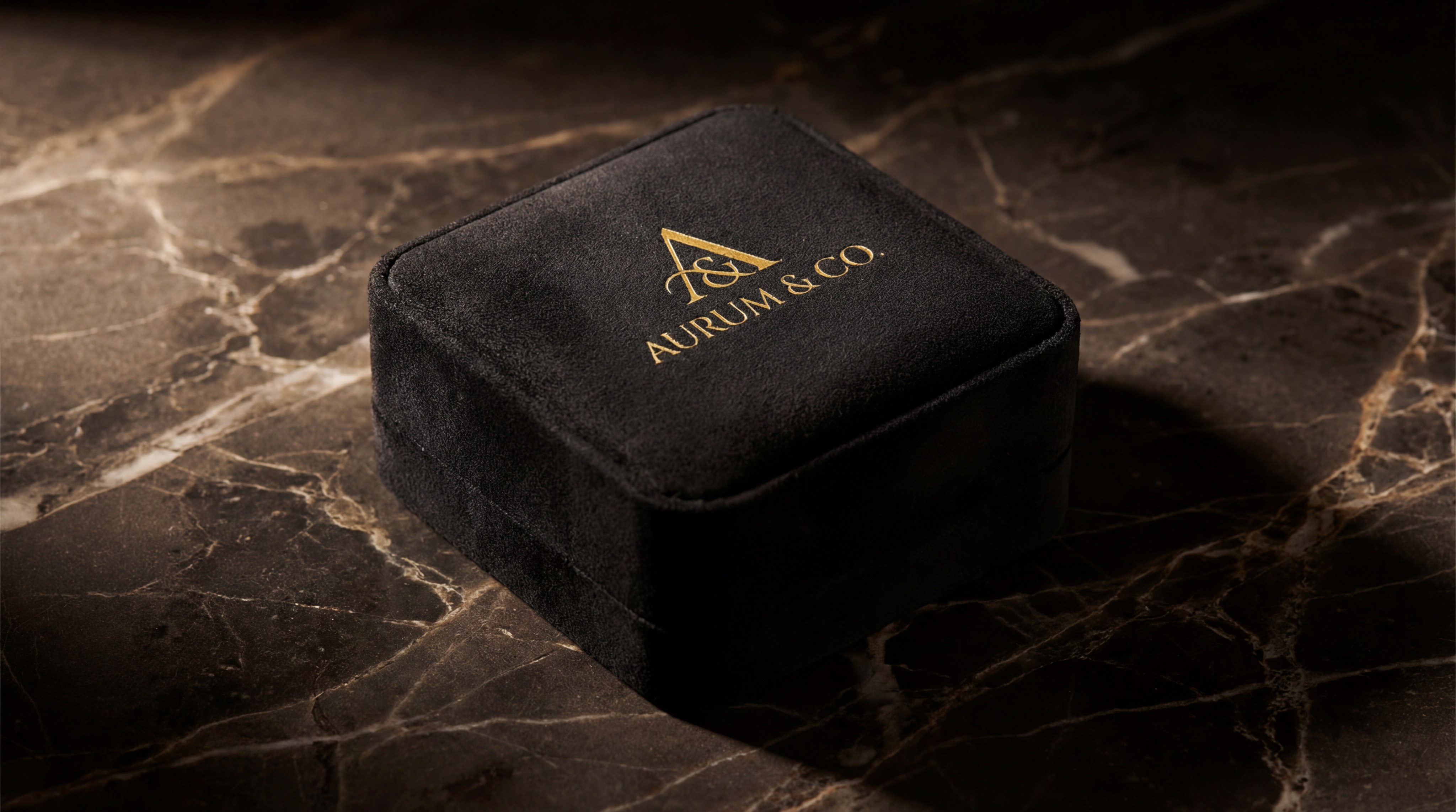
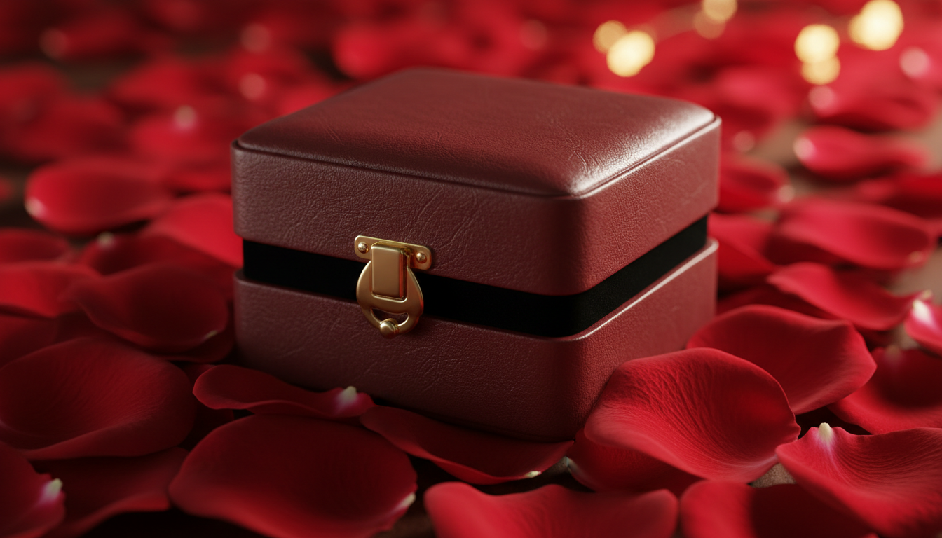
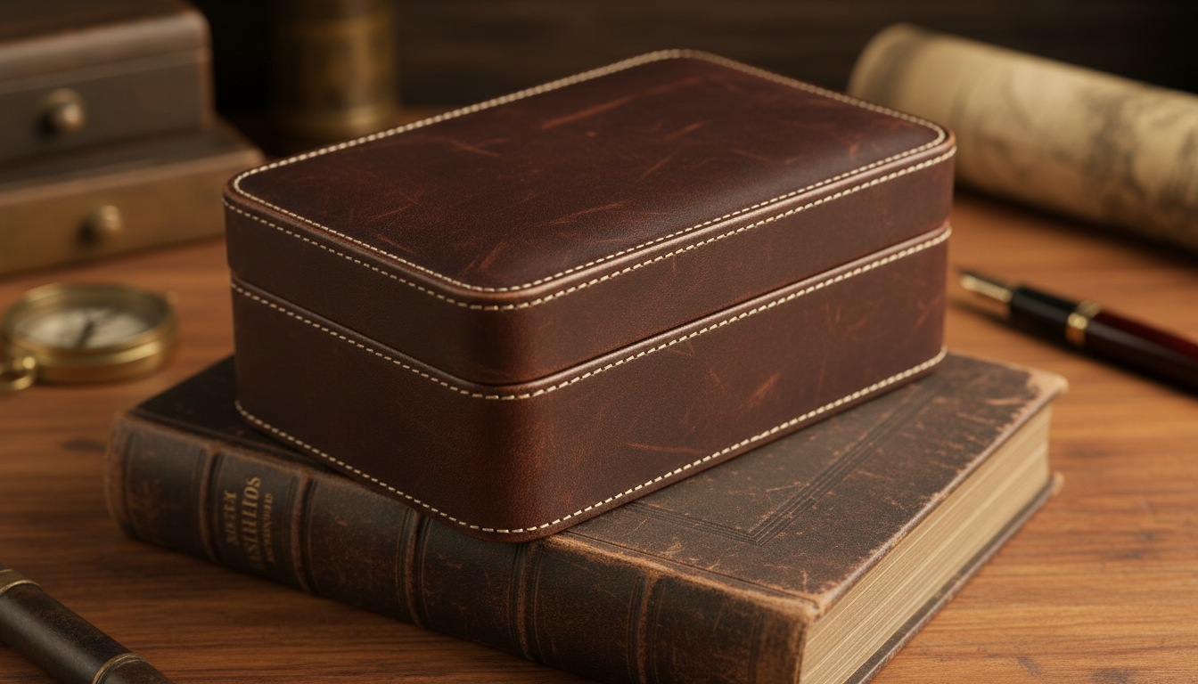
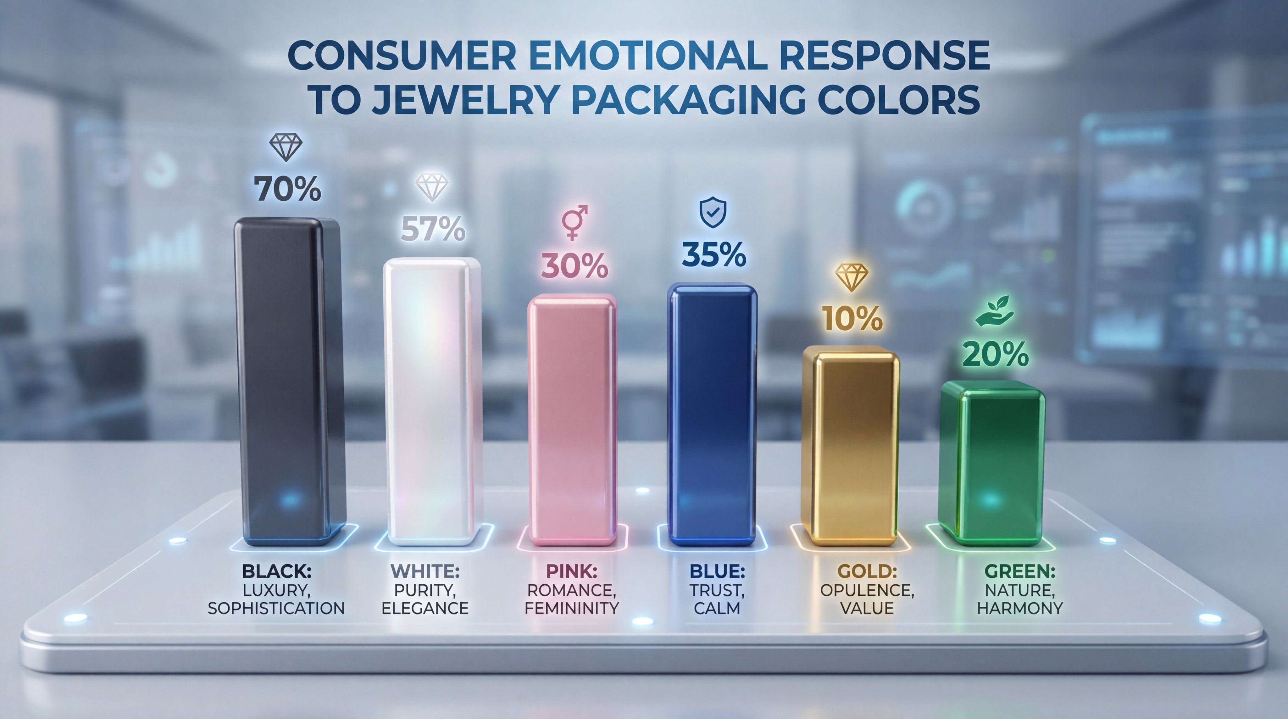
Black is widely considered the best jewelry packaging choice for high-end luxury brands because it symbolizes power, authority, and timeless elegance. The dark backdrop provides the perfect high-contrast surface, allowing gold, silver, and diamonds to pop with maximum brilliance. Think about it: when a customer sees a black velvet box, they immediately associate the contents with exclusivity and high retail value.
Symbolic Meaning of Black
In the world of professional jewelry retail, black represents a brand that is established and confident in its market position. It suggests a sense of mystery and sophistication that appeals to collectors of fine watches and high-end accessories.
- Timelessness: Never goes out of style regardless of current trends.
- Contrast: Enhances the sparkle of precious gemstones.
- Authority: Signals a premium, expert-level brand identity.
And the best part? It is incredibly easy to customize with metallic foils.
| Feature | Impact on Brand Perception | |
|---|---|---|
| Color Symbolism | Authority, Mystery, and High-End Luxury | |
| Best Pairings | Gold Foil, Silver Stamping, White Satin | |
| Target Audience | Luxury buyers, Watch collectors, Men’s jewelry |
Key Takeaway: Black is the ultimate choice for brands aiming for an expensive, authoritative, and classic image that remains eternally relevant.
Is white the best jewelry packaging for bridal sets?
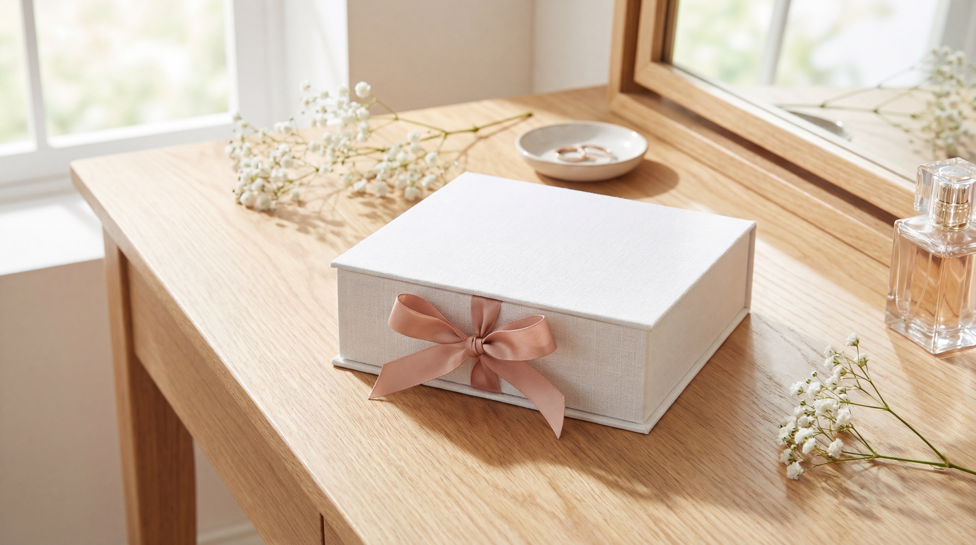
White is the best jewelry packaging for bridal collections as it perfectly mirrors the purity and new beginnings associated with weddings. Using a crisp white necklace box creates a clean, “airy” unboxing experience that feels fresh and sophisticated. This minimalist approach appeals heavily to modern consumers who value clarity and simplicity in their luxury purchases.
Purity and Minimalist Aesthetics
White offers a versatile canvas that works exceptionally well with rose gold and silver chains. It conveys a sense of “perfection” and high-quality craftsmanship without distracting the eye from the jewelry itself.
- Clarity: Highlights the fine details of intricate bridal designs.
- Modernity: Fits the popular “clean girl” aesthetic trending in retail.
- Versatility: Pairs effortlessly with any secondary brand color or ribbon.
But wait, there’s more. It also provides a perfect background for embossed logos.
| Feature | Impact on Brand Perception | |
|---|---|---|
| Color Symbolism | Purity, Simplicity, and Modernity | |
| Best Pairings | Rose Gold, Pastel Ribbons, Embossed Logos | |
| Target Audience | Brides, Minimalists, Gen Z consumers |
Key Takeaway: White conveys a sense of “perfection” and is the primary choice for bridal, pearl, and contemporary minimalist brands.
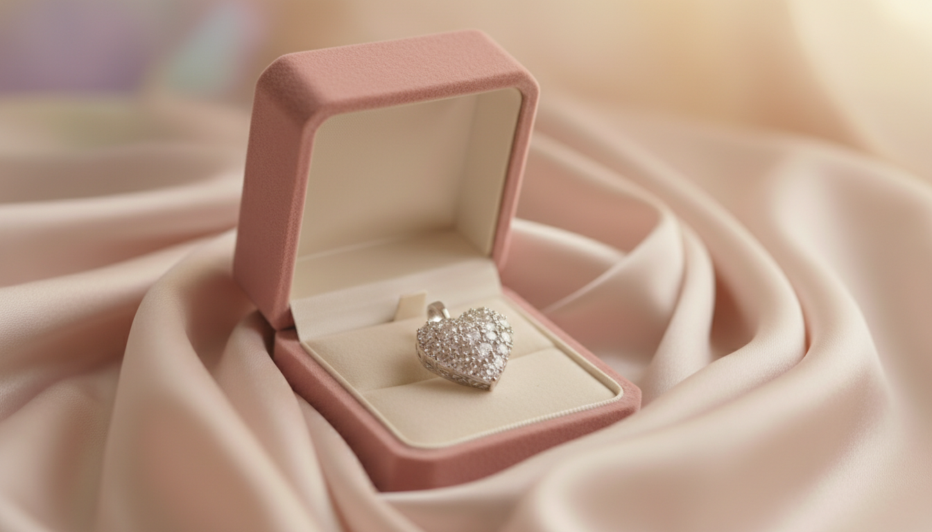
How does pink create the best jewelry packaging for charm?

Pink serves as the best jewelry packaging for sentimental gifts because it evokes feelings of romance, sweetness, and compassion. This color is deeply connected to the “gift of love,” making it the ideal selection for Valentine’s Day, anniversaries, or self-care rewards. By utilizing soft blush tones, brands can build an emotional bridge between the giver and the receiver.
Romance and Sentimental Value
Using pink packaging allows a brand to lean into the emotional narrative of jewelry as a keepsake. While vibrant fuchsia adds a youthful energy, soft dusty pinks suggest a sophisticated and “nude” luxury look that is currently dominating the fashion industry.
- Emotional Connection: Triggers feelings of warmth and affection.
- Femininity: Appeals to traditional feminine aesthetics and romantic styles.
- Playfulness: Works well for charm bracelets and trendy, everyday wear.
Here is the kicker: Pink packaging significantly increases the “gift-ability” of your products.
| Feature | Impact on Brand Perception | |
|---|---|---|
| Color Symbolism | Romance, Softness, and Femininity | |
| Best Pairings | White Gold, Copper Accents, Floral Prints | |
| Target Audience | Young adults, Romantic gift-givers |
Key Takeaway: Pink builds an emotional bridge between the giver and receiver, making it perfect for sentimental and trendy jewelry lines.
Why choose blue as the best jewelry packaging for trust?
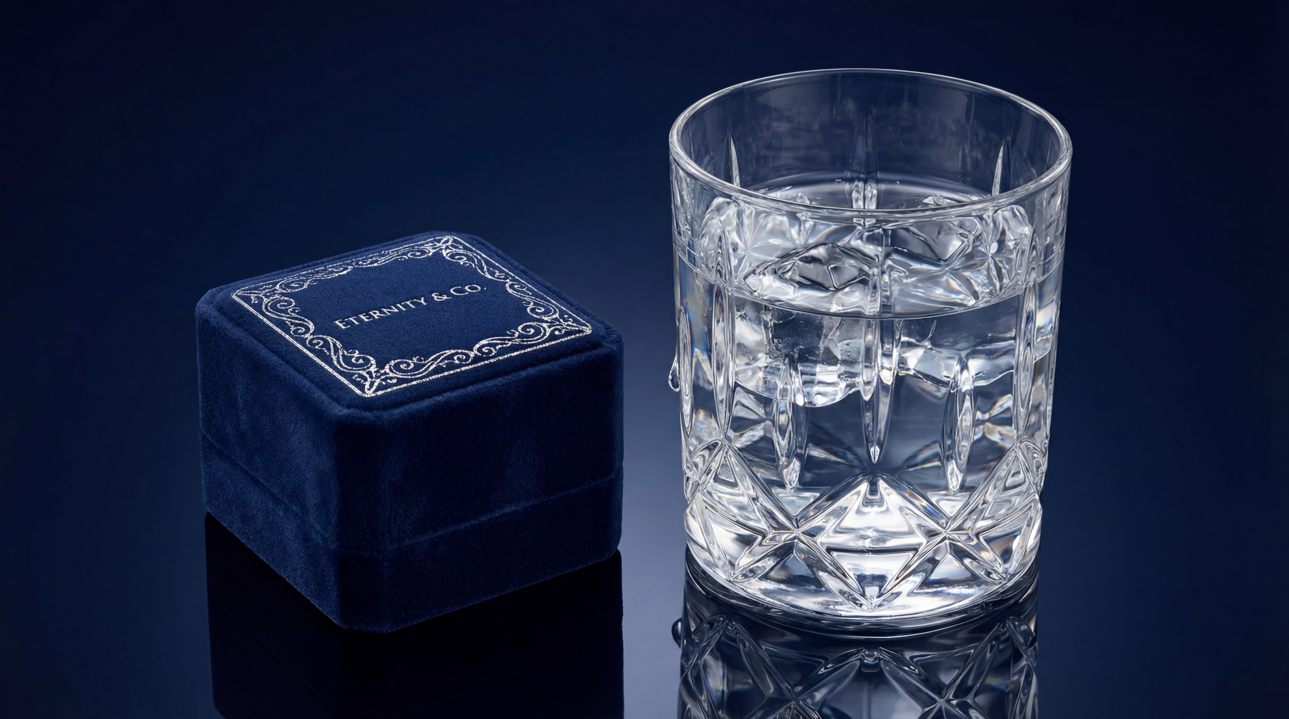
Blue is scientifically proven to be the best jewelry packaging for establishing brand loyalty because it signals reliability and professionalism. A deep navy ring box creates a royal atmosphere that reinforces the customer’s decision to invest in high-value fine jewelry. It is the color of wisdom and stability, which is essential for brands specializing in engagement rings and corporate gifting.
Reliability and Brand Loyalty
In the jewelry industry, blue suggests a heritage-focused brand that is both established and trustworthy. Darker shades like sapphire or navy feel expensive and “old money,” while lighter blues offer a refreshing and calm unboxing experience.
- Stability: Instills confidence in the buyer regarding the product’s quality.
- Heritage: Connects the brand to traditional values of excellence.
- Calmness: Reduces “buyer’s remorse” by creating a peaceful visual experience.
Think about it: Most financial institutions use blue for a reason.
| Feature | Impact on Brand Perception | |
|---|---|---|
| Color Symbolism | Trust, Wisdom, and Stability | |
| Best Pairings | Silver Foil, White Liners, Dark Wood | |
| Target Audience | Fine jewelry buyers, Corporate gifting |
Key Takeaway: Blue is the safest and most effective color for building long-term trust and a sense of established prestige.
Can red be the best jewelry packaging for passion?
Red is considered the best jewelry packaging for brands looking to stimulate the senses and create an immediate feeling of excitement. As a high-energy color, it represents passion, courage, and celebration, making it the perfect choice for festive holiday collections. When a customer sees a red box, their heart rate increases, creating an “action” response that makes the unboxing memorable.
Creating Excitement and Urgency
While bright scarlet is excellent for seasonal promotions, deep burgundy or crimson feels more sophisticated and high-end. Red packaging demands attention on a retail shelf and signals that the contents are precious, bold, and full of life.
- Energy: Creates a high-impact visual that captures attention instantly.
- Passion: Directly correlates with love and deep emotional bonds.
- Urgency: Encourages quick decision-making in a retail environment.
You might be wondering: How do I keep red from looking too aggressive? The secret is pairing it with gold accents.
| Feature | Impact on Brand Perception | |
|---|---|---|
| Color Symbolism | Passion, Energy, and Celebration | |
| Best Pairings | Yellow Gold, Black Velvet, Cream Silk | |
| Target Audience | Valentine’s shoppers, Festive buyers |
Key Takeaway: Use red when you want to evoke strong emotions and create a memorable, high-impact gifting experience.
Is green the best jewelry packaging for eco-brands?
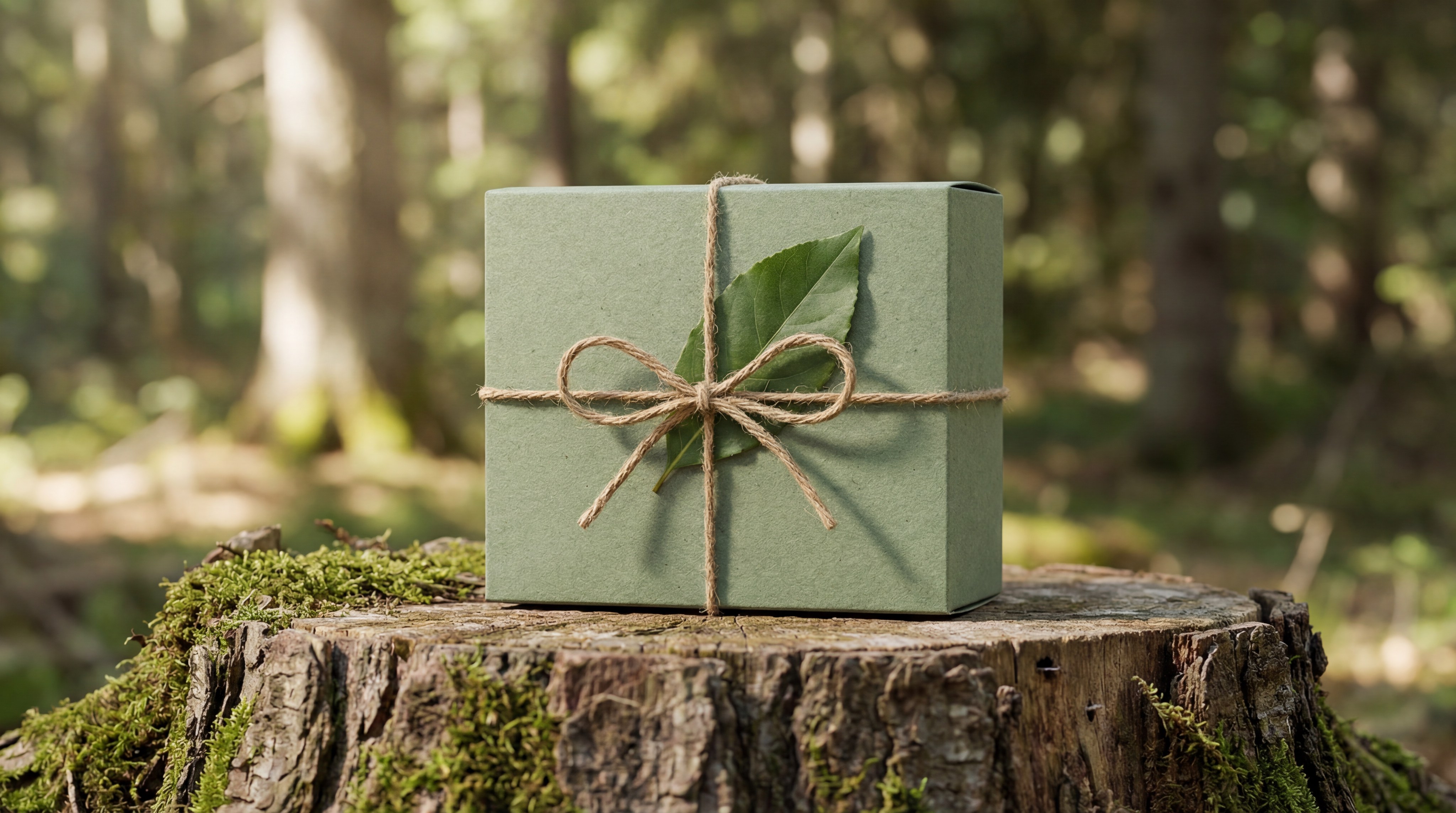
Green has emerged as the best jewelry packaging for modern, ethically-sourced brands that want to emphasize sustainability and harmony with nature. Using an earring box in textured sage or emerald tones immediately communicates a commitment to the environment. It is the hallmark of growth and wealth, making it as much a symbol of prosperity as it is of ecological responsibility.
Harmony and Sustainable Identity
Emerald green suggests a “regal” luxury similar to high-value gemstones, whereas lighter mint tones appeal to the handcrafted and organic market. This color helps eco-conscious consumers identify with your brand values before they even see the jewelry inside.
- Sustainability: Signals that the materials used are environmentally friendly.
- Wealth: Emerald shades are historically associated with royalty and riches.
- Growth: Suggests a brand that is evolving and forward-thinking.
Here is the kicker: Green is the fastest-growing color choice for ethical luxury brands.
| Feature | Impact on Brand Perception | |
|---|---|---|
| Color Symbolism | Nature, Wealth, and Sustainability | |
| Best Pairings | Kraft Paper, Bronze Foil, Natural Twine | |
| Target Audience | Eco-conscious buyers, Gemstone lovers |
Key Takeaway: Green is the premier choice for brands that want to highlight their connection to nature or their commitment to ethical luxury.
How does purple deliver the best jewelry packaging for royalty?
Purple is the best jewelry packaging for artisan and boutique brands that want to appear unique, creative, and regal. Historically associated with nobility due to the rarity of its dye, purple continues to represent luxury, mystery, and magic in the modern marketplace. It is the color of choice for jewelry that is “exceptional” or “artisan-crafted,” setting the brand apart from mass-market competitors.
Nobility and Creative Flair
Deep plum shades pair beautifully with gold leafing to create a royal unboxing experience that feels like a discovery. Meanwhile, lavender tones are better suited for whimsical collections, such as crystals or silver bohemian jewelry, appealing to creative spirits.
- Uniqueness: Helps a brand stand out in a sea of black and white boxes.
- Creativity: Appeals to consumers looking for something artistic and different.
- Mystery: Enhances the sense of discovery during the unboxing process.
Wait, there’s more. Purple is also strongly associated with spiritual and crystal-based jewelry.
| Feature | Impact on Brand Perception | |
|---|---|---|
| Color Symbolism | Royalty, Creativity, and Mystery | |
| Best Pairings | Gold Foil, Amethyst Accents, White Suede | |
| Target Audience | Artisan collectors, Creative spirits |
Key Takeaway: Purple sets a brand apart as “exceptional” and “regal,” making it ideal for unique, high-value handcrafted pieces.
Why is beige the best jewelry packaging for timelessness?
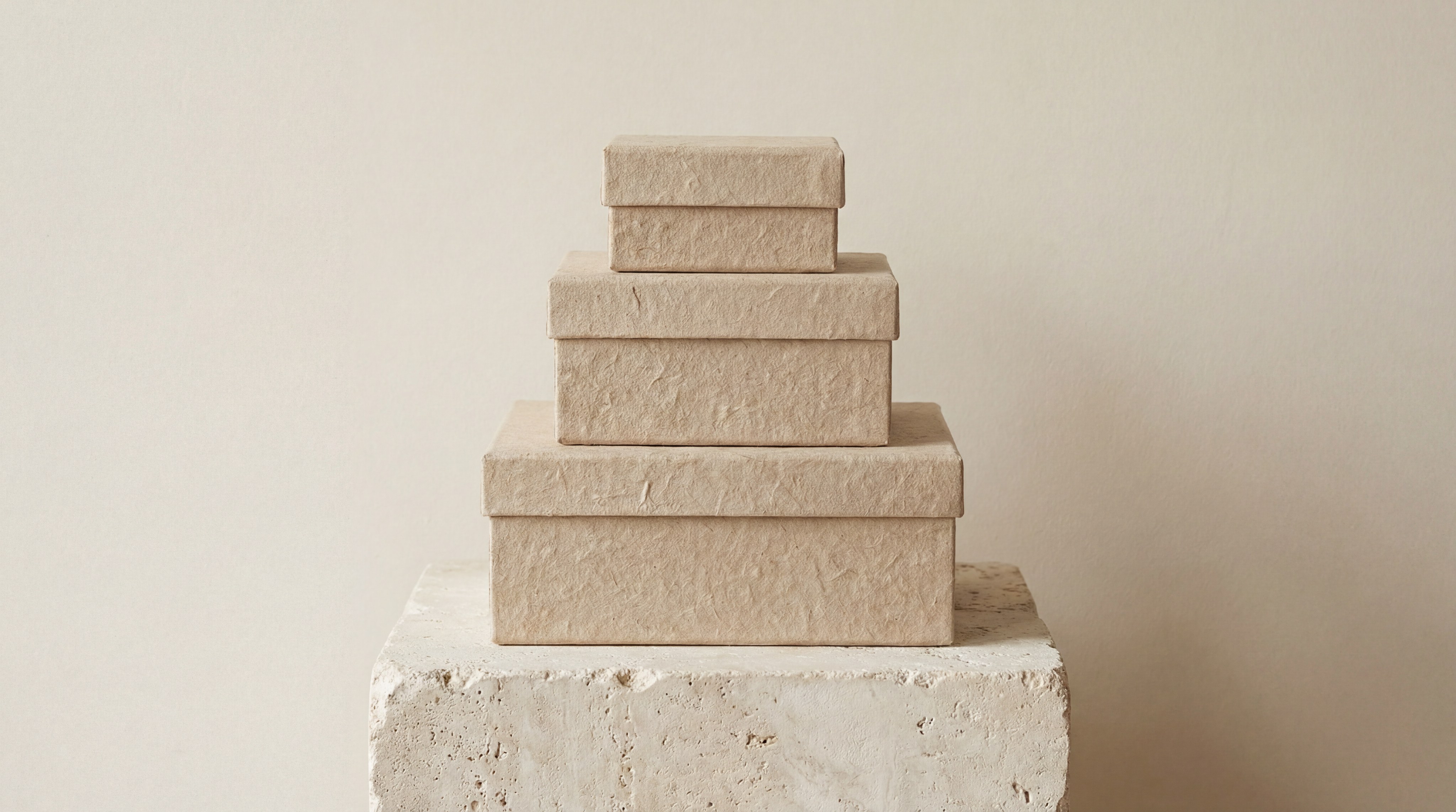
Beige is frequently cited as the best jewelry packaging for “quiet luxury” because it offers a sophisticated, understated canvas that doesn’t distract from the product. Choosing a custom jewelry box in warm, neutral tones allows the craftsmanship of the jewelry to speak for itself. It is the epitome of timelessness, providing a tactile experience that feels high-quality and grounded.
Understated Luxury and Versatility
Because beige is a neutral tone, the texture of the material becomes the primary focus. Linen-textured papers or soft beige suedes create a vintage feel that works across all jewelry types, from everyday gold hoops to expensive diamond studs.
- Neutrality: Complements every metal type, including gold, silver, and rose gold.
- Sophistication: Avoids the “loudness” of bright colors for a more refined look.
- Warmth: Feels more inviting and organic than stark white or cold gray.
It’s no secret: Minimalist brands are moving away from white toward beige.
| Feature | Impact on Brand Perception | |
|---|---|---|
| Color Symbolism | Neutrality, Sophistication, and Warmth | |
| Best Pairings | Brown Accents, Black Ink, Rose Gold | |
| Target Audience | Traditionalists, Minimalist luxury buyers |
Key Takeaway: Beige provides a versatile, timeless canvas that highlights the jewelry’s craftsmanship without distraction.
Is brown the best jewelry packaging for artisan items?
Brown is often the best jewelry packaging for brands that emphasize raw materials, stability, and organic connections. It is the go-to color for “handmade” or “rustic” jewelry lines that want to highlight the authenticity of their products. By using dark chocolate leatherette or recycled kraft paper, brands can communicate a sense of heritage and groundedness that resonates with sustainable shoppers.
Stability and Organic Connections
Brown represents the earth and wholesomeness, suggesting a brand that focuses on the “soul” of the jewelry rather than just surface-level glitz. It is an excellent choice for leather-based accessories, men’s watches, and boho-chic artisan collections.
- Authenticity: Communicates that the product is real and high-quality.
- Durability: Suggests a long-lasting item that will stand the test of time.
- Nature: Connects the brand to the raw, earthy origins of the materials.
Think about it: Leather-bound books and vintage trunks use brown to signal value.
| Feature | Impact on Brand Perception | |
|---|---|---|
| Color Symbolism | Stability, Authenticity, and Earthiness | |
| Best Pairings | Green Accents, Gold Stamping, Cotton Inserts | |
| Target Audience | Boho-chic buyers, Sustainable shoppers |
Key Takeaway: Brown communicates authenticity and stability, making it the perfect fit for artisan and heritage-based brands.
Can gray be the best jewelry packaging for modern brands?
Gray is the best jewelry packaging for modern, tech-forward brands that prioritize professionalism and a sleek, contemporary edge. A pe film jewelry box with a gray frame provides a high-tech, floating display effect that appeals to urban, modern consumers. It is the color of intellect and compromise, offering a neutral ground that feels more professional than white but less heavy than black.
Professionalism and Sleek Modernity
Gray acts as a perfect modern neutral that works exceptionally well for unisex jewelry lines and innovative designs. It pairs beautifully with silver and bright neon accents, creating a cool, industrial aesthetic that feels very current in the 2026 market.
- Modernity: Fits perfectly with minimalist, high-tech jewelry designs.
- Intellect: Signals a brand that is thoughtful and design-oriented.
- Professionalism: Creates a crisp, clean look that is ideal for B2B gifting.
Here is the kicker: Gray is the ultimate neutral for showcasing silver and platinum pieces.
| Feature | Impact on Brand Perception | |
|---|---|---|
| Color Symbolism | Modernity, Intellect, and Neutrality | |
| Best Pairings | Silver, Bright Neon Accents, Glass | |
| Target Audience | Modernists, Tech-savvy consumers |
Key Takeaway: Gray is the ultimate modern neutral, offering a professional and sleek presentation for innovative and unisex jewelry lines.
Summary Table: Choosing the Best Jewelry Packaging Color
| Color | Primary Emotion | Best For | Retail Vibe | |
|---|---|---|---|---|
| Black | Luxury & Power | Diamonds / Watches | High-End | |
| White | Purity | Bridal / Pearls | Minimalist | |
| Blue | Trust | Fine Jewelry | Professional | |
| Red | Passion | Valentine’s / Holiday | Energetic | |
| Green | Nature | Sustainable / Emeralds | Organic |
Frequently Asked Questions
1. Can I customize my packaging colors for specific seasonal collections?Yes, most manufacturers offer custom color matching (Pantone) to ensure your limited-edition collections maintain brand consistency while having a unique visual identity.
2. What is the best jewelry packaging color for high-end diamonds?Black and Navy Blue are traditionally considered the best because they provide the highest contrast, allowing the diamond’s brilliance to stand out effectively.
3. Can I use multiple colors in one jewelry box design?Absolutely. Many modern brands use a “dual-tone” approach, such as a gray exterior with a bright pink interior, to create a surprise element during the unboxing experience.
4. What is the best jewelry packaging material for a matte finish?High-quality art paper and soft-touch lamination are the best materials for achieving a premium matte finish that is also resistant to fingerprints.
5. Can I order custom samples to test color accuracy?Yes, it is highly recommended to request a physical sample before mass production, as colors can appear differently on digital screens than on physical materials.
Conclusion
Selecting the right color is the first step in creating a brand that resonates with your target audience and justifies a premium price point. Whether you choose the authority of black or the sustainability of green, your packaging should be a reflection of your brand’s core values. Ready to transform your unboxing experience? To get a free quote and professional design consultation,