The most successful luxury jewelry packaging designs leverage a combination of iconic color palettes, premium tactile materials, and signature mechanical “reveals” to create an unforgettable unboxing experience. You have likely spent months perfecting a bespoke piece, only to realize that presenting it in a standard, uninspired box feels like a betrayal of your craftsmanship. When a client opens a high-ticket item and the packaging feels flimsy or generic, the perceived value of your hard work evaporates instantly.
Think about the stakes: a poor first impression doesn’t just lose a sale; it tarnishes your brand’s reputation in an industry built on prestige. To avoid this, you need to study the elite luxury brands with the best packaging to understand how they transform a simple container into a legendary marketing tool. This guide breaks down the top ten designs that define modern luxury.
Which luxury brands with the best packaging use bold prints?
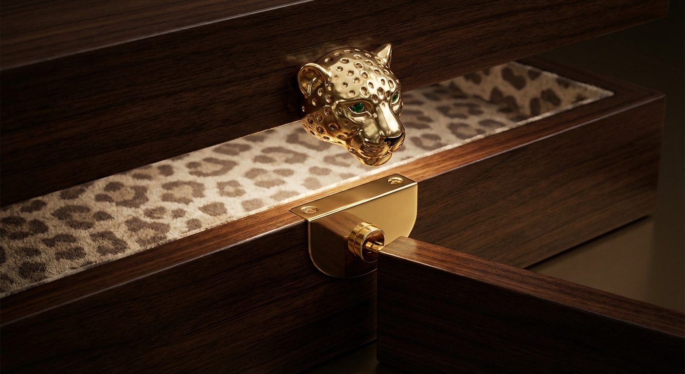
Leading brands like Effy utilize exotic leopard motifs and bold interior prints to contrast with a sophisticated, minimalist exterior. Studying luxury brands with the best packaging reveals that the “surprise and delight” factor often comes from what is hidden inside the box rather than what is on the lid. By using high-grade pearl paper on the outside and high-definition fabric prints on the inside, you create a layered narrative for your client.
The Power of the Leopard Motif
Effy Jewelry stands out by blending a fashion-forward mindset with high-end rigid materials. Their use of exotic prints inside a classic wooden or cardboard exterior creates a moment of high-fashion impact.
- Utilizes high-definition textile printing for interior linings.
- Features metallic leopard head latches for a tactile, “heavy” feel.
- Balances wild patterns with neutral, earthy exterior tones.
Here is the kicker: the interior print acts as a frame that makes the jewelry pop, especially for yellow gold or diamond-heavy pieces.
Balancing Global Trends and Brand Heritage
To replicate this, you should focus on high-grade pearl paper and reinforced rigid cores. This combination ensures the box feels sturdy while the leopard-print interior targets a modern, confident consumer base.
- Employs 1200gsm greyboard for structural integrity.
- Uses pearlized paper finishes to catch the light during the reveal.
- Focuses on the “click” of the metal latch to signify premium quality.
Think about this: a box that feels like a fashion accessory is a box that your clients will keep on their vanity forever.
Key Takeaway: Using unexpected interior patterns can differentiate your brand from traditional, monochromatic luxury competitors.
Summary: Bold Print Packaging Profile
| Element | Specification | |
|---|---|---|
| Primary Material | High-grade pearl paper and rigid cardboard | |
| Signature Accent | Bold leopard print interior with metal hardware | |
| Target Audience | Fashion-forward, modern luxury consumers |
This design proves that luxury doesn’t always have to be understated; sometimes, a bold statement is exactly what a high-end client craves.
Why do luxury brands with the best packaging blend art and gems?
Elite houses like Van Cleef & Arpels treat their packaging as an extension of the jewelry itself, often incorporating rare stones and artistic collaborations into the box design. These luxury brands with the best packaging understand that for a client, the box is the first chapter of the story. By moving beyond paper and fabric, you signal that the contents are so precious they require a “temple” of their own.
Collaborative Masterpieces
Van Cleef & Arpels often collaborates with traditional artists to create boxes that serve as standalone collector’s items. This elevates the packaging from a utility item to a piece of fine art.
- Incorporates traditional Japanese lacquer techniques.
- Uses hand-painted motifs that mirror the jewelry’s design themes.
- Features limited edition runs that increase brand desirability.
Now, get this: when the packaging is a limited edition, the secondary market value of the entire set skyrockets.
Geometric Precision and Rare Inlays
By utilizing materials like red jasper, quartzite, and high-lacquer wood, you can create a “Minaudiere” style box. This geometric precision creates a sense of mathematical perfection that resonates with fine jewelry buyers.
- Uses CNC-machined wooden cores for absolute precision.
- Features stone inlay work on the exterior lid.
- Employs multi-layer lacquering for a mirror-like finish.
But there is more: the weight of a stone-inlaid box provides a psychological cue of “heaviness” that clients associate with genuine value.
Key Takeaway: Treating the box as a piece of art encourages clients to view your jewelry as a generational heirloom.
Summary: Artistic Inlay Packaging Profile
| Element | Specification | |
|---|---|---|
| Primary Material | Lacquered wood and rare stone inlays | |
| Design Style | Geometric, architectural, and highly decorative | |
| Unique Feature | Collaborative art pieces integrated into the structure |
The fusion of art and gems ensures that the unboxing process is just as valuable as the jewelry found inside.
Is Cartier the king of luxury brands with the best packaging?
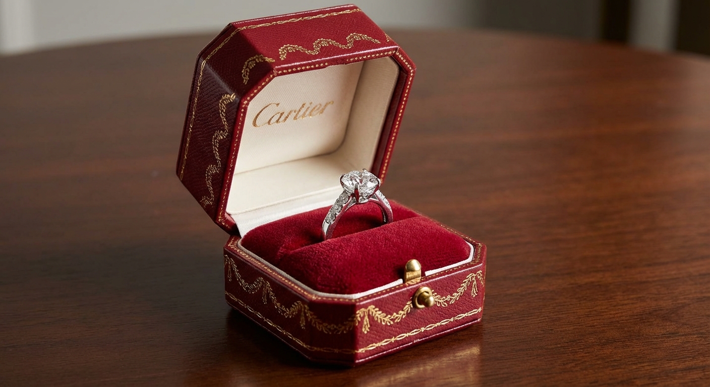
Cartier remains the benchmark because of its octagonal red box, which has become a universal symbol of luxury, prestige, and historical elegance. Many luxury brands with the best packaging attempt to mimic this iconic status, but few achieve the same level of global recognition. The key lies in the perfect marriage of a specific “Cartier Red” with intricate gold-embossed details.
Iconography of the Deep Red Box
The octagonal shape is not just a design choice; it is a signature that identifies the brand from across a room. This shape provides more structural strength than a standard square box while offering a unique tactile experience.
- Features a custom “Cartier Red” leatherette finish.
- Uses a reinforced spring-loaded hinge for a crisp opening sound.
- Includes a recessed base to make the box appear to float.
Wait, there’s more: the specific “click” of a Cartier box is engineered to sound authoritative and expensive.
Gold Garlands and Velvet Linings
The “Garland” motif, embossed in gold around the edges, pays homage to the brand’s French aristocratic roots. Inside, the use of high-density cream velvet provides the perfect backdrop for high-clarity diamonds.
- Employs precision gold foil stamping for the garland border.
- Features a plush, multi-layered velvet insert.
- Uses a silk-lined interior lid for a soft-touch finish.
Here’s the thing: consistency over decades has made this box more recognizable than the jewelry of most other brands combined.
Key Takeaway: A signature shape and color, maintained consistently, can become your brand’s most powerful visual asset.
Summary: Cartier Style Packaging Profile
| Element | Specification | |
|---|---|---|
| Primary Material | Fine leatherette and gold-stamped metal | |
| Signature Color | Deep Crimson (Cartier Red) | |
| Unique Feature | Iconic octagonal silhouette with gold garland detailing |
Mastering this classic aesthetic ensures your brand communicates a sense of timelessness and established authority.
How do luxury brands with the best packaging prioritize earth?
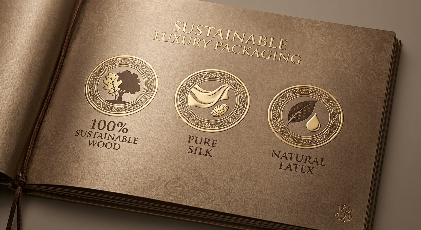
Modern luxury brands with the best packaging, such as Bvlgari, are now prioritizing sustainable materials like wood fiber and natural latex without sacrificing an ounce of elegance. You no longer have to choose between being eco-conscious and being high-end. In fact, high-end clients now expect sustainability as a standard feature of a luxury purchase.
Sustainable Luxury Evolution
Bvlgari’s recent shift toward 100% plastic-free packaging demonstrates how natural materials can feel incredibly premium. They use paper sourced from sustainably managed forests and natural silk linings.
- Replaces plastic cores with reinforced wood fiber.
- Uses 100% pure silk for cushions and interior linings.
- Employs natural rubber tree latex as an eco-friendly adhesive.
Believe it or not: eco-friendly materials often have more interesting textures than their synthetic counterparts.
Roman Architecture in Sustainable Design
While the materials are modern and green, the design often incorporates the “Pantheon grid” or octagonal star patterns. This anchors the brand’s sustainable future in its historic Roman past.
- Uses 3D embossing to create architectural textures.
- Features bronze-toned finishes that mimic ancient metalwork.
- Employs chemical-free dyes for all paper and fabric components.
It’s worth noting: using sustainable materials is a major talking point that your sales team can use to build rapport with conscious buyers.
Summary: Sustainable Packaging Profile
| Material Source | Luxury Application | Eco-Benefit | |
|---|---|---|---|
| Wood Fiber | Rigid box core | 100% Biodegradable | |
| Natural Silk | Jewelry cushions | Renewable resource | |
| Natural Latex | Structure adhesive | Chemical-free assembly |
Key Takeaway: Sustainability is the new gold standard; using earth-friendly materials enhances your brand’s ethical appeal.
By following this model, you prove that your brand is forward-thinking and responsible, which are key traits of modern luxury.
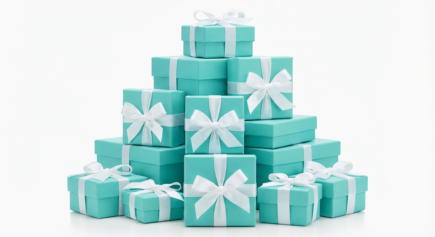
What defines Tiffany as one of luxury brands with the best packaging?
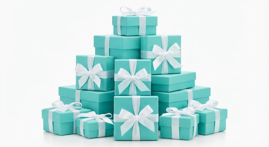
Tiffany & Co. defines the category by proving that a single, trademarked color can be more valuable than the product itself. Many luxury brands with the best packaging try to create complex designs, but Tiffany succeeds through radical simplicity. The “Tiffany Blue Box” relies on psychological triggers of happiness, purity, and high-society status.
Psychology of Tiffany Blue
The specific shade of robin’s egg blue is so iconic that it immediately triggers an emotional response in the recipient. You can achieve a similar effect by choosing a custom Pantone color that is unique to your brand.
- Uses a trademarked Pantone 1837 color.
- Relies on high-quality matte paper that resists fingerprints.
- Maintains a strict “box-only-given-with-purchase” policy to keep it exclusive.
Now, get this: people have been known to buy empty Tiffany boxes on the secondary market just for the status.
Minimalist Construction and White Satin
The design is deceptively simple, consisting of a rigid blue box and a hand-tied white satin ribbon. This minimalist approach ensures the focus remains on the brand’s signature color.
- Employs a “lid and base” construction for a traditional feel.
- Features a white satin ribbon that is designed to be pulled easily.
- Uses a minimalist logo placement that doesn’t compete with the color.
Think about it: when your brand color is this strong, you don’t need fancy textures or complex hardware.
Key Takeaway: A signature color, if used correctly, becomes an “unspoken logo” that communicates your brand identity instantly.
Summary: Tiffany Style Packaging Profile
| Element | Specification | |
|---|---|---|
| Primary Material | Sustainably sourced matte rigid paperboard | |
| Signature Color | Tiffany Blue (Pantone 1837) | |
| Unique Feature | Iconic white satin ribbon and bow |
A simple, color-driven strategy can often be more effective than the most complex engineering.
Can new luxury brands with the best packaging use modern tech?
Emerging luxury brands with the best packaging are leveraging GRS-certified recycled plastics and high-tech marble-textured papers to appeal to a younger, digitally-native audience. These brands understand that the modern client values both innovation and aesthetics. By using advanced printing and materials, you can create a look that feels “ultra-modern” rather than “old-world luxury.”
Contemporary Aesthetics and Recycled Materials
Clancy Garrett and similar players use Global Recycled Standard (GRS) materials to create high-gloss, marble-textured finishes. This provides the look of heavy stone without the weight or environmental cost.
- Uses recycled plastics for the inner structural frame.
- Employs high-definition marble-patterned paper coatings.
- Features modern, sans-serif logo embossing for a clean look.
Here is the kicker: younger luxury buyers are more likely to share a “tech-forward” unboxing experience on social media.
Functional Interlocks and Multi-Storage
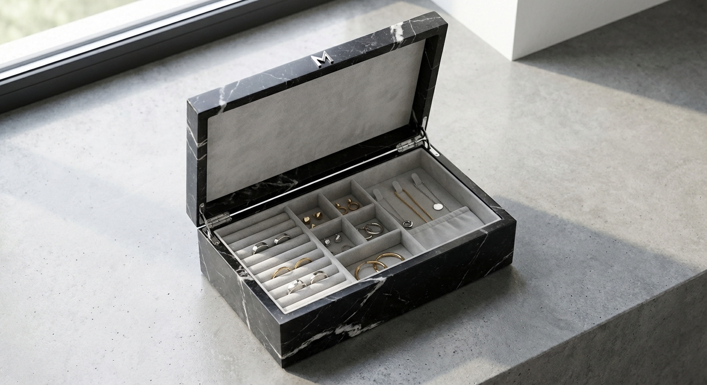
Newer designs often focus on the functionality of the box after the purchase. Multi-compartment interiors allow the box to serve as a permanent travel case or vanity organizer.
- Features specialized slots for rings, earrings, and necklaces in one box.
- Uses magnetic interlocking systems for modular storage.
- Employs microfiber linings that prevent tarnish and scratches.
Think about this: if the box is useful every day, your brand stays at the front of the client’s mind every day.
Key Takeaway: Integrating modern materials and versatile functionality appeals to the values of the next generation of luxury buyers.
Summary: Modern Tech Packaging Profile
| Element | Specification | |
|---|---|---|
| Primary Material | GRS-certified recycled plastic and marble paper | |
| Functional Feature | Multi-compartment interior for daily organization | |
| Style Profile | Minimalist, high-tech, and social media-friendly |
By embracing technology, you can position your brand as a leader in the “new luxury” space.
Which luxury brands with the best packaging mirror diamond cuts?
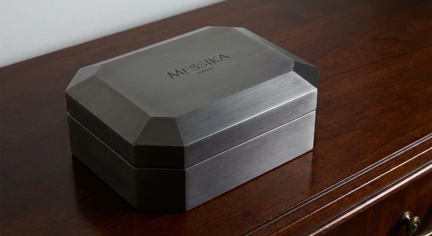
Brands like Messika adopt an architectural approach, where the box itself is shaped to mimic the facets of a diamond or gemstone. These luxury brands with the best packaging use geometry to create a physical connection between the container and the product. When the box looks like a large, faceted jewel, it reinforces the value of what is inside before the lid is even lifted.
Architectural Approach to Design
Messika’s packaging features sharp, clean lines and octagonal shapes that reflect a “Parisian chic” aesthetic. This geometric complexity requires advanced die-cutting techniques to ensure every edge is perfectly crisp.
- Uses sharp-angled lid designs that mimic stone facets.
- Employs metallic coatings to create a “reflective” stone-like surface.
- Features hidden hinges to maintain the architectural silhouette.
Wait, there’s more: a faceted box catches the light in a showroom just as well as the jewelry does.
Rational Elegance in Cool Tones
By choosing cool tones like dark grey, silver, and matte black, these brands create a “rational” luxury feel. This contrasts with the warm, plush feel of traditional jewelry brands, appealing to those who prefer modern elegance.
- Uses metallic-flecked paper for a subtle “diamond dust” sparkle.
- Employs cool-touch materials like aluminum or treated paper.
- Features minimalist, silver-foil branding.
Here’s the thing: cool tones and sharp angles communicate a sense of precision and high-end engineering.
Key Takeaway: Mirroring the physical properties of your jewelry in your packaging design creates a cohesive and powerful brand story.
Summary: Geometric Faceted Packaging Profile
| Element | Specification | |
|---|---|---|
| Primary Material | Rigid shell with metallic paper or aluminum coating | |
| Shape | Octagonal or faceted to mimic diamond cuts | |
| Color Palette | Slate Grey, Metallic Silver, and Charcoal |
This design style is perfect for brands that specialize in modern, diamond-centric fine jewelry.
Why do luxury brands with the best packaging feel like royalty?
Chaumet and other historic houses use deep royal blues, gold hardware, and double-door mechanisms to evoke a sense of imperial authority. These luxury brands with the best packaging leverage the psychology of “the reveal.” When a box opens like the doors of a temple, it transforms a simple transaction into a royal coronation for the client.
Chaumet and the Napoleonic Legacy
As the jeweler to Empress Josephine, Chaumet uses a specific shade of royal blue that has historical ties to the French crown. This color choice immediately communicates heritage and “old money” luxury.
- Features deep navy blue leather or high-pile velvet.
- Uses 18k gold-plated hinges and latches.
- Employs silk-screened gold logos that mimic royal crests.
But there is more: the weight of the leather and the density of the velvet make the box feel like a treasure chest.
The Double-Door “Temple” Experience
The double-door opening mechanism is a masterclass in suspense. It requires the client to use both hands to reveal the jewelry, which forces them to slow down and savor the moment.
- Uses a split-lid design that opens from the center.
- Features soft-close magnetic dampers for a smooth feel.
- Includes a rising interior platform that “presents” the jewelry as the doors open.
Now, get this: the “Temple” opening is one of the most filmed and shared unboxing styles on luxury blogs.
Key Takeaway: Incorporating “ceremonial” opening mechanisms can turn your product reveal into a significant emotional event.
Summary: Royal Style Packaging Profile
| Element | Specification | |
|---|---|---|
| Primary Material | Premium leather, royal velvet, and gold hardware | |
| Opening Style | Double-door “sanctuary” or center-split reveal | |
| Brand Vibe | Imperial, historic, and extremely exclusive |
Using these royal design cues ensures that your clients feel like they are purchasing a piece of history.
How do luxury brands with the best packaging stay minimalist?
Minimalist luxury brands with the best packaging, like Anne Klein, use soft ivory tones and clean lines to communicate “quiet luxury.” You can achieve a high-end feel without being flashy by focusing on the quality of the paper and the subtlety of the branding. In a world of loud marketing, luxury brands with the best packaging often stand out by being the quietest in the room.
The Grace of Ivory and Soft Textures
Ivory and cream tones are often perceived as more sophisticated and approachable than stark white. By using textured “felt” paper or imitation leather, you provide a tactile experience that feels organic and expensive.
- Uses ivory-colored “soft-touch” paper coatings.
- Features debossed branding rather than printed logos.
- Employs rounded edges to create a softer, feminine silhouette.
Think about this: a minimalist box is less likely to clash with a client’s home decor, meaning they are more likely to display it.
Symbolism of the Interior Logo
A minimalist exterior is often paired with a powerful symbolic logo hidden inside the lid. This creates an “inner secret” that only the owner of the jewelry knows, adding to the sense of exclusivity.
- Includes a symbolic icon (like a lion or a flower) embossed in the lid.
- Uses tonal colors for the interior (ivory on ivory) for a subtle look.
- Features a simple silk ribbon pull for the jewelry tray.
Wait, there’s more: a hidden logo creates a sense of “if you know, you know” luxury that high-end clients love.
Key Takeaway: Minimalist design works best when every tiny detail—from the paper texture to the lid tension—is executed perfectly.
Summary: Minimalist Packaging Profile
| Element | Specification | |
|---|---|---|
| Primary Material | Textured ivory cardboard or imitation leather | |
| Color Palette | Cream, Ivory, and Matte Black | |
| Unique Feature | Symbolic debossing on the interior lid |
Minimalism isn’t the absence of design; it’s the perfection of the essentials.
Do Italian luxury brands with the best packaging set trends?
Italian houses like Salvatore Ferragamo set the standard by treating jewelry boxes with the same level of craftsmanship as their world-famous leather goods. These luxury brands with the best packaging focus on tactile grain and high-gloss finishes that feel “hand-crafted.” When you use Italian-inspired design, you are signaling a commitment to artisan quality and fashion-forward thinking.
Texture-Rich Presentation
Ferragamo often uses vertical grains or “Saffiano” textures on their boxes. This makes the packaging feel like it was cut from the same leather as a high-end handbag or a pair of luxury shoes.
- Employs UV-coated paper with deep, tactile grain patterns.
- Features high-gloss finishes that reflect light like polished leather.
- Uses contrasting textures (matte base vs. gloss lid) for visual interest.
Believe it or not: the way a box feels is just as important as how it looks in a luxury setting.
The “Heaven and Earth” Structure
The “Heaven and Earth” design (a traditional lid and base structure) is given a modern update with high-tension fits. This means the lid slides off slowly, creating a vacuum effect that builds anticipation.
- Uses precision-cut liners to create “slow-release” lid tension.
- Features contrasting interior colors (e.g., red exterior, white interior).
- Employs heavy-weight rigid board to give the box “heft.”
Here is the kicker: that three-second delay as the lid slowly slides off is pure psychological marketing gold.
Key Takeaway: Texture and mechanical tension are the “silent communicators” of luxury that differentiate a trendsetter from a follower.
Summary: Italian Trend Packaging Profile
| Element | Specification | |
|---|---|---|
| Primary Material | UV-coated textured paper and rigid board | |
| Design Feature | High-gloss vertical grain and “slow-slide” lid | |
| Brand Vibe | Artisan, fashionable, and tactile |
Italian-style packaging ensures your jewelry feels like it belongs on the runways of Milan.
Conclusion
The top 10 luxury brands with the best packaging all share a single philosophy: the box is not a container, but a storyteller. Whether it is the royal heritage of Chaumet, the color-driven power of Tiffany, or the sustainable innovation of Bvlgari, these designs prove that packaging is an investment in your brand’s future. By focusing on premium materials, unique opening experiences, and signature aesthetics, you can transform your jewelry into a legendary experience.
At YX Jewelry Packaging, we believe that your craftsmanship deserves a stage that is just as brilliant as the jewelry itself. We are dedicated to helping boutique owners and global houses alike create bespoke packaging that leaves a lasting legacy. If you are ready to elevate your brand to the level of these global icons, contact us today to start designing your bespoke jewelry packaging solution.
Frequently Asked Questions (FAQs)
Can I customize luxury packaging for a small boutique? Absolutely. Most high-end manufacturers now offer rapid prototyping and low MOQs for custom designs, allowing smaller brands to utilize premium materials like velvet and specialty papers without massive upfront costs.
What is the best material for eco-friendly luxury packaging? FSC-certified paper and wood fiber are currently the gold standards. These materials provide the rigid strength required for luxury presentation while remaining 100% biodegradable and chemical-free.
How do I know if my box lid tension is correct? The “luxury slide” should take approximately 2-4 seconds to open under its own weight. If it falls off instantly, it feels cheap; if it gets stuck, it frustrates the client and ruins the reveal.
Can I use LED lighting in my luxury jewelry boxes? Yes, integrated LED lighting is a massive trend for engagement rings. A small, hidden light in the lid can enhance the “fire” of a diamond during the unboxing, especially in dimly lit environments.
What is the most durable color for jewelry packaging? Darker tones like navy, charcoal, and forest green are the most practical for long-term use. While white and ivory are elegant, they are much more susceptible to fingerprints and visible wear during shipping and handling.